

The Wolf Den #26 - Bitcoin, Legacy Markets, RSI Divs And More!

Bitcoin Charts And Analysis
MONTHLY CHART
Last week, after many months, we added a new level in purple. I have now added another new level - the blue line. Exciting times! Remember, these lines are more like zones or areas.
The last monthly candle was less than ideal - it was a bit of a shooting star or an inverse hammer. It's up for interpretation. Regardless, the long upper wick and lower bodies indicate there was a ton of selling interest in February. That said, this candle is only an issue if March ends up red as well. Candles require confirmation by the following candle.

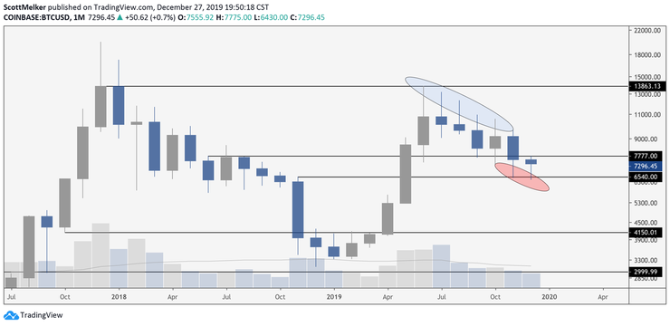
Remember this tweet? Now we have added another candle with a long upper wick. Easy to visualize supply and demand in this context.
WEEKLY CHART
This remains my favorite time frame. As we know, price broke out of the descending channel a few weeks ago and made a sizable move up. I have been mentioning for weeks the possibility that price could come back to test that top of that channel as support and that it would still be bullish - something in the $7,770 area. This would also be a golden pocket retrace or even a 70.5% OTE (optimal trade entry) of the move from $6,430 to $10,522.
That said, price has bounced perfectly off of the 50% retracement level, which is more than enough of a drop before potentially continuing up. I included the fresh blue monthly level on this chart so that you can see why it is important - it lines up exactly with that 50% level.
EMAs look good. Price is currently trying to recapture the 21 EMA as support (purple) and bounced above the 50 EMA (blue).
If you personally like to use wicks for finding divs (more on divs below), then there is a potential hidden bull div on the weekly with RSI. This would confirm at candle close with a definitive elbow up on RSI, as it looks now. If you do not prefer to use wicks and use candle closes instead, this div is not there.
DAILY CHART
The daily chart looks decent as well. Clear bounce out of the blue demand zone (you draw these off of the last candle before price exits an area). Trading above the 200 EMA.
On the negative side, price is below the 21 and 50 EMAs, both of which are curving down as resistance. Also, you can see a fresh resistance level drawn in blue. THE LINE at $9,090 is still the key level for me on the daily chart. Bears should salivate at the idea of shorting that area.
This does not mean that I am bearish. It is not a statement on where I think the price will go.
The goal of any trade is to find an entry as close to invalidation as possible to minimize your loss and maximize potential reward. Take trades where a tight stop is justified.
A poker player will often push in all of their chips on a hand that is statistically likely to lose. Why? Because the amount of money in the pot (pot odds) justify the risk.
Trading is very similar. You can be bullish and STILL decide to short a potential level of resistance.
6 HOUR CHART
Institutional traders love the 6 hour chart - very similar to the 4 hour. You can see here that price was clearly in a descending wedge and broke out to the upside. There was sustained bullish divergence (from the 12 hour down) that preceded this move up. EZPZ.
WYCKOFF ACCUMULATION

I post trading ranges quite frequently, which are largely based on the Wyckoff trading method. Above is the accumulation schematic. It would take hours to explain the entire Wyckoff method, but here are the basics on accumulation.
The process of accumulation is the first stage of the Wyckoff price cycle. The Accumulation stage is caused by increased institutional demand. Bulls are slowing gaining power and as a result, they are poised to push prices higher.
Although the Accumulation stage is related with the bulls gaining authority, the price action on the chart is flat. In other words, the process of accumulation is illustrated by a ranging price structure on the chart.
Higher bottoms within the range is usually considered a signal that the price action is currently in an Accumulation phase.
This is the hourly BTC chart (as of 6 AM EST). I think that you can likely see the similarities! Either price should be preparing to exit the top of the range and continue up into "markup" or revisit the range lows to create a spring. My opinion is that the spring already happened and that price is now making local higher lows.
HXRO
One token I've been keeping an eye on is HXRO. The token has been one of the best performers in the market over the last 3 months.
The chart continues to look amazing, with a major increase in volume over the past few weeks. Price has broken up from consolidation after consolidation on the way, and is presently retesting a key support.
The token has been interesting enough to me that I reached out to their CEO Dan Gunsberg and had him on my new podcast.
Dan is a trader and executive who came from the legacy derivatives markets and is incredibly knowledgeable on both the trading and digital asset space (not to mention a good guy).
Hxro is a new type of crypto trading exchange that gives traders a super innovative and alternative way to trade. As opposed to trading an auction market (e.g. normal spot or perpswap exchanges), you are trading a digital option contract. The contracts are offered in timeframes from 1-min to daily. These options are parimutuel. This means all positions go into a liquidity pool with in-the-money positions sharing the total pool at expiration of the contract. This creates a new dimension of fairness and payoff possibilities for our user base.
It also makes trading noisy markets way easier as you don't need to worry about stops or order entry levels. It just simplifies trading down to a higher or lower.
Unfortunately it is not currently available for traders in the US (you will get geoblocked if you try to trade from a US IP). However Ive been watching it as their markets give me an real time view of market sentiment at different time intervals.
I can see them being a serious competitor to the exchange sector of the crypto market as their markets seem to be more additive rather than directly competing with the existing derivatives landscape.
Although I don't analyze FA too much, their token market cap looks to be incredibly cheap relative to other exchange sector tokens.
Altcoin Charts
All of these setups depend on what Bitcoin does! I am still trading alts successfully and am cautiously optimistic. Just keep in mind that risk management is everything - don't get destroyed if Bitcoin decides to rip either up or down.
CHZ/BTC
I am personally interested in this if it bounces off of support around 114. It may not drop that far. Use it as you see fit, it has definitely broken out of the local descending wedge. I am NOT in this trade.
HBAR/BTC
HBAR is at resistance, so I am not interested here. If it flips 449 to support, I will likely be a buyer. I am NOT in this trade.
MATIC/BTC
This still looks great. It is holding the major red support line and has broken up from consolidation (through the pink line). I am still expecting this to be a nice swing trade and to continue up. Would be really nice to see it above the local highs, in the area of 250. I am in this trade and avoided stopping out by a thread.
NEO/BTC
I am posting this because I know a number of you are in this trade. It was a disappointment for me - I stopped out already when price broke back below the neckline of the Inverse Head & Shoulders. Price is back at that point, and has confirmed hidden bullish divergence with RSI at support. This caused a move up. Price is also in a slightly ascending channel and looks like it wants to potentially head up. I am NOT in this trade - just offering an update of how I am presently looking at it for those of you who may still be in.
POWR/BTC
I really like this setup. I bought this morning, was hoping that it would not break out before the newsletter! It is holding the key ascending black support. A bounce off of that could be a nice entry if it happens. It's breaking the local descending resistance and is holding the key area of horizontal support (blue).
THETA/BTC
Theta is breaking up from the old trading range once again and also is breaking descending resistance. Below is the wider view. I like this anywhere above the old trading range, around 1450. I am not currently in THETA.
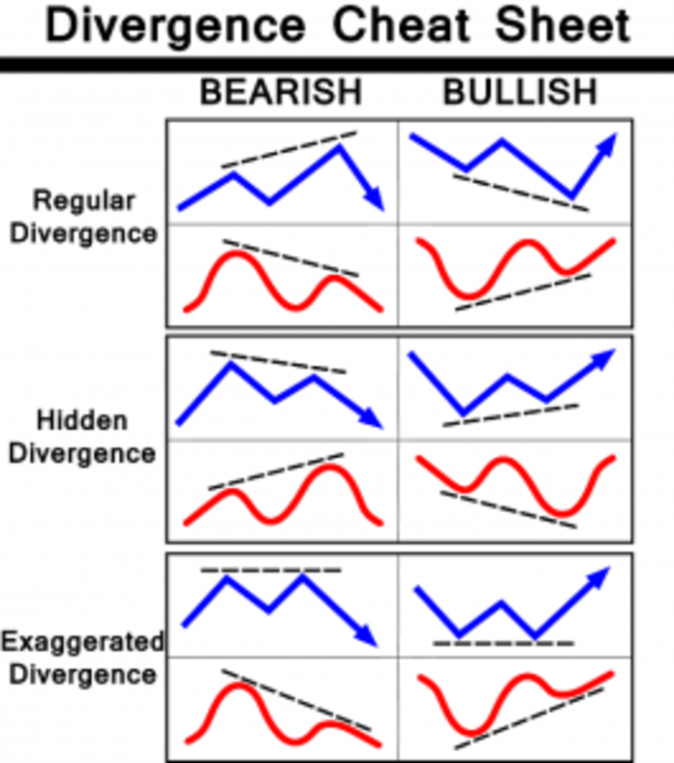
RSI And Divergences 101 - The Basics
If you have been following me for a while, then you know that my single favorite strategy for identifying trading opportunities is bullish and bearish divergences. In my case, I primarily use RSI, but the strategy is the same regardless of indicator. This is a very basic first guide on RSI and divergence basics - I will expand upon it in future issues.
Here is a basic cheat sheet for identifying divergences. Today we will focus on regular (or standard) divergences.
What is RSI?
RSI stands for Relative Strength Index. It’s a momentum indicator, which means that it measures the speed (or strength) of the movement of a price. More specifically, it compares the magnitude of recent gains and losses over a specific time period. That time period is usually configurable and you’ll see that a popular period is 14, meaning that it will use the last 14 candles in the calculation.
All of this is normalized to a scale of 0 to 100. So if the RSI indicator is closer to the lower end (let’s say 20), this means that the price has been in a downtrend for a while now and is in the oversold area. However, if the RSI indicator measures closer to the higher end (for example 80), it signifies that the price has been in an uptrend for a while and is in the overbought area.
You have probably heard the following strategy for RSI many times - it is unreliable!
If the RSI indicator is greater than 70, the price is overbought and you should sell.
If the RSI indicator is below 30, the price is oversold and you should buy.
Price can keep going up, long after the RSI indicator showed a value larger than 70. And the price can keep going down for a long time after the RSI measured a value lower than 30. Simply put, RSI overbought and oversold regions are not reliable signals to go long or short.
***It should be noted that traders expect RSI to travel to overbought once it is oversold and to oversold once it is overbought, although there is no specific indication of how long this will take.
Enter Divergence!
A regular RSI divergence (not hidden) is when the price makes higher highs in an uptrend and the RSI indicator makes lower highs. Or in the other direction: when the price makes lower lows in a downtrend and the RSI indicator makes higher lows.
Remember that the RSI indicator is a momentum or strength indicator. As long as the price and the RSI indicator line up, we can say that the current trend or price move is showing momentum in a specific direction. But once we see the price and the RSI indicator diverge, this momentum is fading. RSI divergence indicates that the current trend is losing strength. RSI divergence shows us that the current trend is losing momentum and the conditions are setting up for a trend reversal. These are the early stages of a momentum shift, and that’s exactly what we’re looking for as reversal traders. They are by far the most powerful in overbought and oversold territory.
Drawing Divergences
There are a couple of things you need to keep in mind when drawing divergences. During an uptrend, you connect the highs (and not the lows!) in order to detect a divergence. At the same time, we connect the highs and not the lows of the RSI indicator. These highs and lows must coincide - you have to compare the exact same date or time on price as on RSI.On the other hand, if we are in a downtrend, we need to connect the lows (not the highs) of a price trend and the lows of the RSI indicator as well.
Using A Line Chart
Divergences can be confusing on a candle chart, because traders often argue as to whether they should use wicks or real candle bodies. Using a line chart, rather than a candle chart, can eliminate the noise. Line charts are calculated solely on candle closes, so they give a stronger divergence signal.
How To Trade It
There are numerous strategies for trading with RSI. I prefer to take a position when the divergence is confirmed - when I see the defined "elbow" on RSI after a candle close. It is important to watch for a divergence on the other side (hidden bearish or bearish divergence) to indicate that the div has completed or is invalidated. I will sometimes take a position before confirmation if the div looks very likely to confirm, but this is very risky and not recommended until you are very comfortable identifying these opportunities.
Bitcoin Daily Divs Since All Time High
This is a quick chart that I just drew up of daily divergences with RSI on the Bitcoin chart since the all time high. I may have missed some. This DOES NOT INCLUDE HIDDEN DIVERGENCES, which have also been very powerful. Nearly every top and bottom for the past few years has been preceded by an overbought or oversold divergence. This is the case on almost any chart of any asset that you look at.
Here is the monthly chart for the SPY (tracks the US stock market). You can see that there have been 2 major bearish divergences with overbought RSI. One preceded the market correction of late 2018. The other confirmed in February of this year - and we all know what is happening to that market!
The Bottom Line - The Quick Notes
Divergences with RSI are a powerful tool for identifying likely price reversals
They are most powerful when they occur in overbought and oversold territory
They have been present at nearly all Bitcoin tops and bottoms
It is essential that you compare the exact same points on RSI and price
A divergence is confirmed when RSI makes a definitive move in the opposing direction, creating an elbow or point worthy of comparing to price
Traders expect RSI to travel to overbought once it is oversold and to oversold once it is overbought
They work best in confluence with clear chart patterns and candle structures - like the January shooting star on the SPY chart above
RSI divergences are not a magic formula - no indicator or strategy is correct all of the time. However, if used correctly, they can provide you with valuable information about the momentum of the current trend and the possibility of a future trend reversal. It’s especially interesting for reversal traders and early trend traders since a lot of their trading strategy revolve around correctly detecting a shift in trend direction.
Interview With Nathaniel Whittemore
I throughly enjoyed this interview. Although it is short, we covered a ton of ground, including my thoughts on Bitcoin as a store of value or digital gold and the state of the current global market. Nathaniel is a brilliant guy with a great podcast - very flattering to be a part of it.
Legacy Market Thoughts
What an absolute rollercoaster. Only a few days ago, the Dow had it's largest point drop in history. Price saw it's fastest descent into official correction in history, going from all time high to a 10% correction in 10 days. Yesterday saw the largest point gain in history. Whiplash.
That rise is bullish, right? Not necessarily.
The four largest percentage gain days in the history of the Dow were during the recession of 2008 and 2009, while the market was crashing.
Huge rallies in a volatile market can be very dangerous, luring traders into the belief that price is reversing. I’m not saying that’s the case now, but panic buying can be as risky as panic selling.
It remains to be seen whether price has reversed or not. The chart certainly looks like a bullish reversal, but charts are somewhat useless in a black swan event like the coronavirus.
The market was down tremendously on Friday, before rallying in the last hour of trading. Price rose almost 600 points in the last 5 minutes of the session. How can this be explained? I have spoken to a number of traders at major hedge funds, all of whom agree that it was short covering. Large funds do not like to hold positions through the weekend when price action is volatile and news can alter events at any moment. So what happens when they take profit on shorts and sell? They are forced to buy. This send price skyrocketing, liquidating other short sellers or causing them to cover their positions. This is the most likely reason for the rally on Friday - a technical short squeeze.
Monday's rally was not a surprise, but pundits wisely continue to advise caution. While the size of the pump was astounding, the fact that price bounced from historically oversold levels of RSI after the worst week in the history of trading is no shock. Cantor Fitzgerald is recommending their clients sell if the SPX reaches 3200 - just an illustration that many of the biggest funds are still bearish.
The FED and Central Banks around the world are all coming together to assist in propping the market. The Q7 met today and said that they will do whatever is necessary to help. The current administration obviously will do anything it can to avoid a meltdown. It is my belief (and that of many others) that a biological crisis cannot be stopped by rate cuts and QE. The virus is going to continue to spread and people are likely to stay at home. The global economy will likely slow as this happens. For me, this means that rationally, the market will continue to suffer. If this was truly a free market, it would be dumping in an even more historical manner. But the market has help from central bankers and governments. In the famous words of Keynes,
“Markets can stay irrational longer than you can stay solvent.”
This is what I know. The world has a supply problem, for now. China may come back online soon, but at the moment 1/4 containers coming into the Port Of Los Angeles have been canceled. Supply chains are stressed or non existent - that will take time to fix.
The world is likely to have a demand problem, which I alluded to before. When people stay at home or are in quarantine, they cease to be consumers of most products.
Supply + Demand Problems should equal a serious economic slowdown.
I am not sharing charts today, because I don't think they are particularly useful or that it's responsible to offer trade ideas in a risky environment. As for what I have been doing, I am still short SPY from 325, Apple from 300, Tesla from 875 average and UBER from 41. I have shared all of this before. In addition, I have sold some longer term holdings on the bounces, including at the end of the day yesterday - namely some SPY and Disney (30% of revenue is their parks, not great if the virus proliferates). Keep in mind, most of my equity positions are up 100%+! I am not taking losses, I am taking PROFIT when I am selling. That is why I am willing to move some money to cash. Totally different than if you are new to the market. That's why you cannot and should not follow someone else's trades - their ideas are based on their situation, not yours.
Hope Is Not A Trading Strategy
The impulse to be hopeful in markets is part of human nature. When you are fixated on a specific result but stymied on a price/time basis, hope becomes a dangerous four-letter word.
There is nothing inherently wrong with hoping that a trade will go your way. However, many traders depend solely on hope to determine their exits and entries - and hope can rapidly to turn to fear and greed.
Hope is contingent upon outside factors happening in your favor, so you become a cheerleader, hoping things will turn around or go your way. This is a very frustrating position to be in. Eventually, emotions take over. You may begin to doubt yourself. Instead of following the lead of the markets, you get angry when the markets don’t follow your lead. This becomes a downhill spiral, and it’s one that is very hard to recover from.
Traders should have a fixed plan every time they enter and exit a trade with 3 prices in mind - entry, exit and stop loss. Period. These should not change after the trade is executed. This eliminates hope from the equation.
Pay attention to the market action. Stop trading on hope. Stop wishing for a certain outcome. When money is on the line and volatility is elevated, tread carefully and trade your plan.
Robinhood App Down For 17 Hours
Robinhood, the free stock-trading app, crashed on the worst day possible.
Absolutely brutal. On arguably the best day of trading in history, the preferred app of Millennial traders was down. This is a familiar situation for crypto traders, who experience this regularly from garbage exchanges that either can't or choose not to handle high traffic. But this is unheard of in legacy markets. I have to imagine there are quite a few law suits coming from traders who attempted to either buy stock or exit short positions. This is just a reminder that technology is amazing until it fails. There is always risk with having your money with a broker or exchange - especially in crypto.
The views and opinions expressed here are solely my own and should in no way be interpreted as financial advice. Every investment and trading move involves risk. You should conduct your own research when making a decision. I am not a financial advisor.